From dispatch to doorstep — rebuilding the tools that field execs, delivery partners, and ops teams at India's largest parcel network use every single day.
As Design Lead for the ₹8,000 Cr+ Express (Last Mile) vertical, I owned the UX for the tools 100,000s of field staff rely on daily.
Manual dispatch, cash/COD friction, clunky partner onboarding, low engagement — and little real-time visibility on the ground.
FE App 2.0, Partner App 2.0, QR-first payments, a gamified engagement layer, and real-time dashboards — designed for speed and fewer errors.
QR adoption up 21%→32% (~₹2.5L/day saved) and design throughput roughly doubled after moving to weekly design sprints.
Delhivery is India's largest logistics company — parcel delivery, warehousing, freight, and cross-border, serving 18,000+ pin codes since 2011. I led design for its fastest-moving layer: the Express Last Mile, spanning dispatch, delivery, partner onboarding, payments, and field engagement.
Field visits, shadowing, and system audits surfaced friction at every step of the Last Mile — hurting both operations and experience.
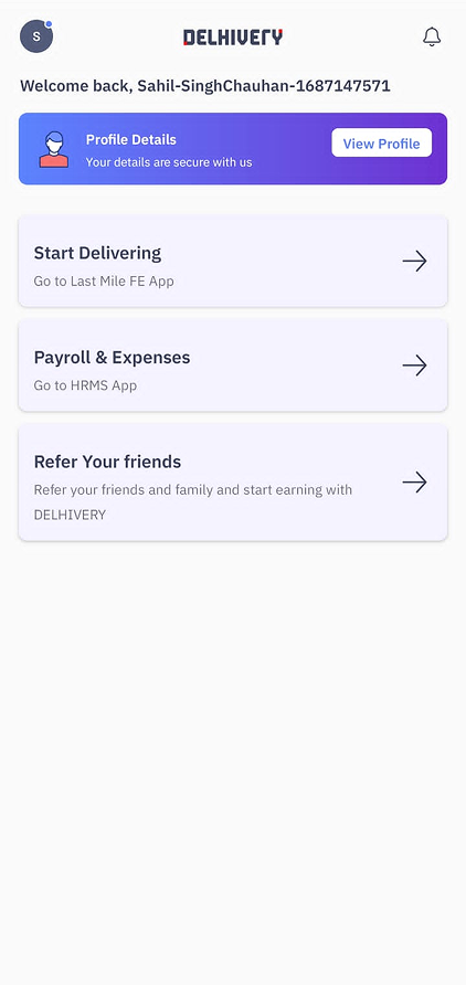
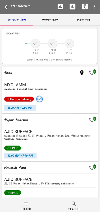
Outdated UI, unclear task flows, and poor route visibility slowed agents and hurt delivery success.
Manual, telecaller-led onboarding was error-prone and drove partner drop-off. No self-serve meant no scale.
~85% of COD was cash — a safety and reconciliation risk. QR was buried and failed often on weak networks.
Field execs had no motivation beyond payouts — no way to reward performance or recognize progress.
The LM Eye dashboard was hard to navigate with no parcel-level real-time view, so DC teams couldn't act fast.
A 12:2 PM-to-designer ratio and 5-day sprints kept the team reacting, not planning.
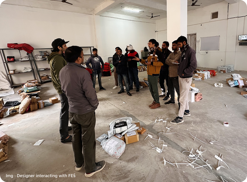
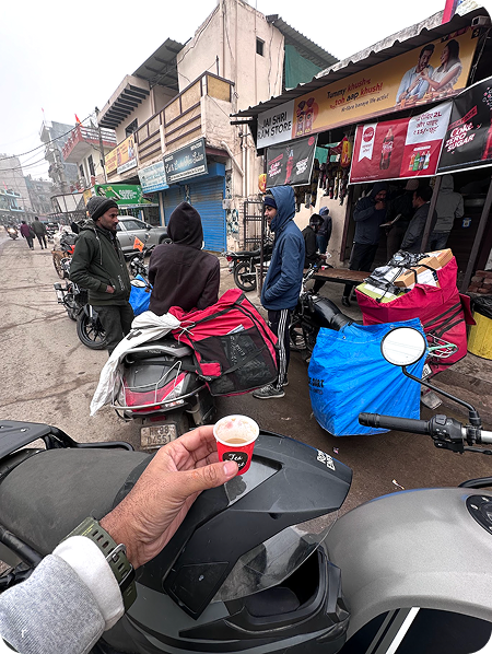
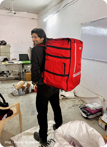
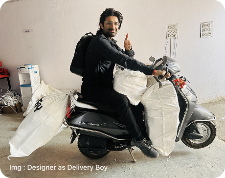
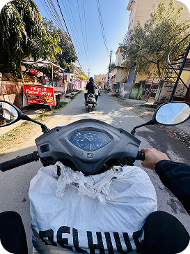
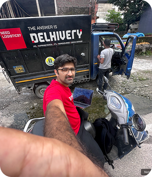
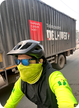
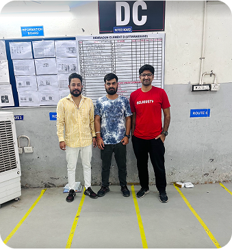
Grounded in on-ground immersion — I shadowed FEs and delivered parcels myself — every decision optimized for one thing: faster, error-free action for people working on their feet.
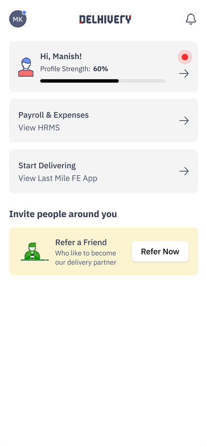
Rebranded to a high-contrast black/red palette for outdoor readability, cut clutter, and surfaced the day's work first — with "Profile Strength" nudges to pull agents through onboarding.


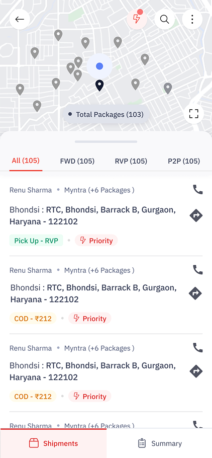
Applied proximity and F/Z gaze patterns, added a map view, moved key tabs to a bottom nav, and pushed urgent stops to the top so agents plan routes at a glance.


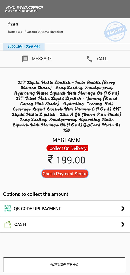
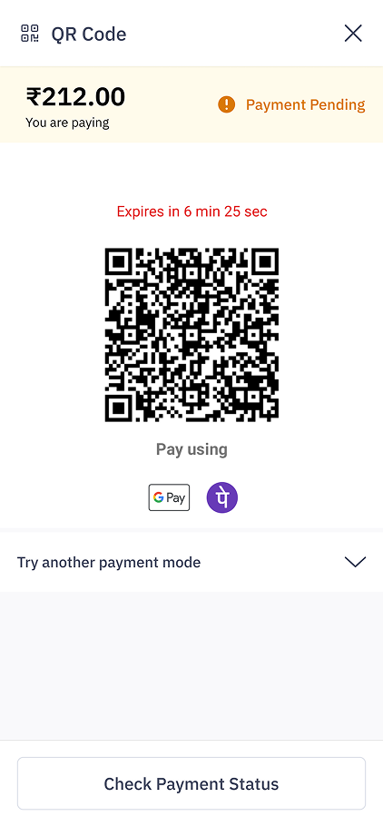
Made QR the always-visible default, added clear payment feedback and proof capture, and nudged agents away from cash at the moment of collection.


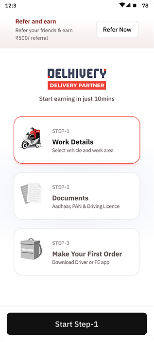
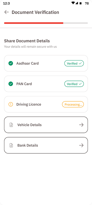
Replaced telecaller onboarding with an interactive self-serve flow — a clear 3-step path (Work Details → Documents → First Order), refer-and-earn, and forms paired with document mockups to cut errors.


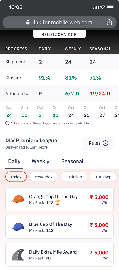
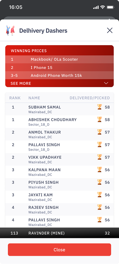
A gamified performance layer with badges, live ranks, and real prizes (MacBook, iPhone) surfaced up front — reinforced with a bold black/red identity to build morale and healthy competition.


Redesigning the Last Mile wasn't about updating screens — it was about giving clarity, control, and confidence to the people moving millions of parcels a day.